Your Shopify store has traffic. Your product pages have visitors. And still, most of them don’t buy.
That’s not a traffic problem. It’s a product page problem.
Three German Shopify brands do it differently: Doonails, Snocks, and 3Bears. Different categories, different price points, but the same logic behind their product pages. Let’s look at what they actually do first — the principles behind it will make sense on their own.
Three Product Pages That Actually Sell
Doonails: How Social Proof Dominates a Category
Doonails essentially built the German DIY nail market from scratch, and their product page shows how. With over a million customers, social proof isn’t an add-on feature here — it’s the whole architecture. The page answers three questions in seconds: What do I get? Why do I trust this? Why now?
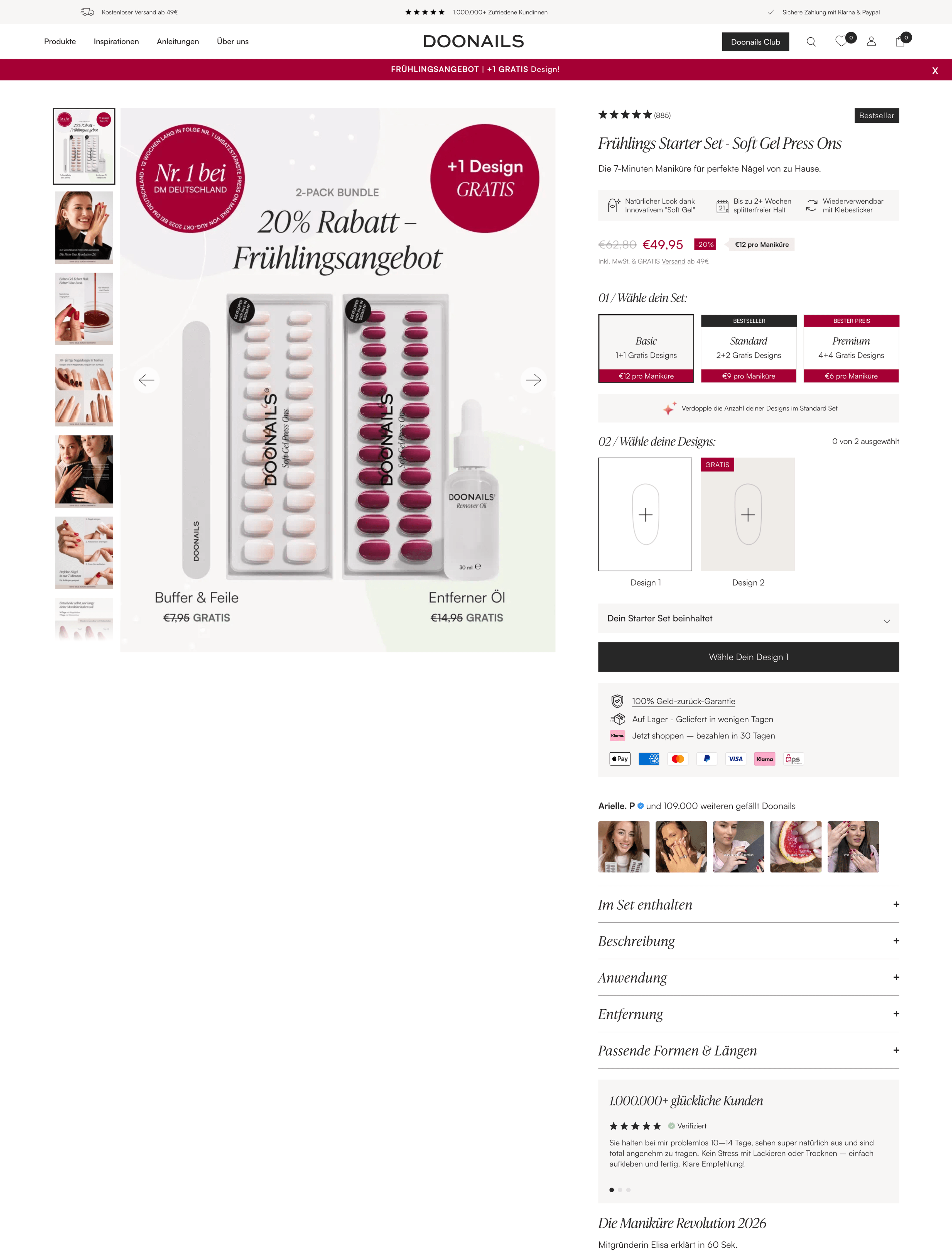
The principle: Star ratings above the fold create instant trust, and a UGC gallery on scroll delivers the second trust layer — spatially separated, sequentially timed.
Snocks: Why Less Friction Sells More Than Attention
Snocks is a study in reduction. Their product page for basic socks has no surprises and no gimmicks, and it still converts above average. The reason is unspectacular: fewer obstacles on the way to a purchase.
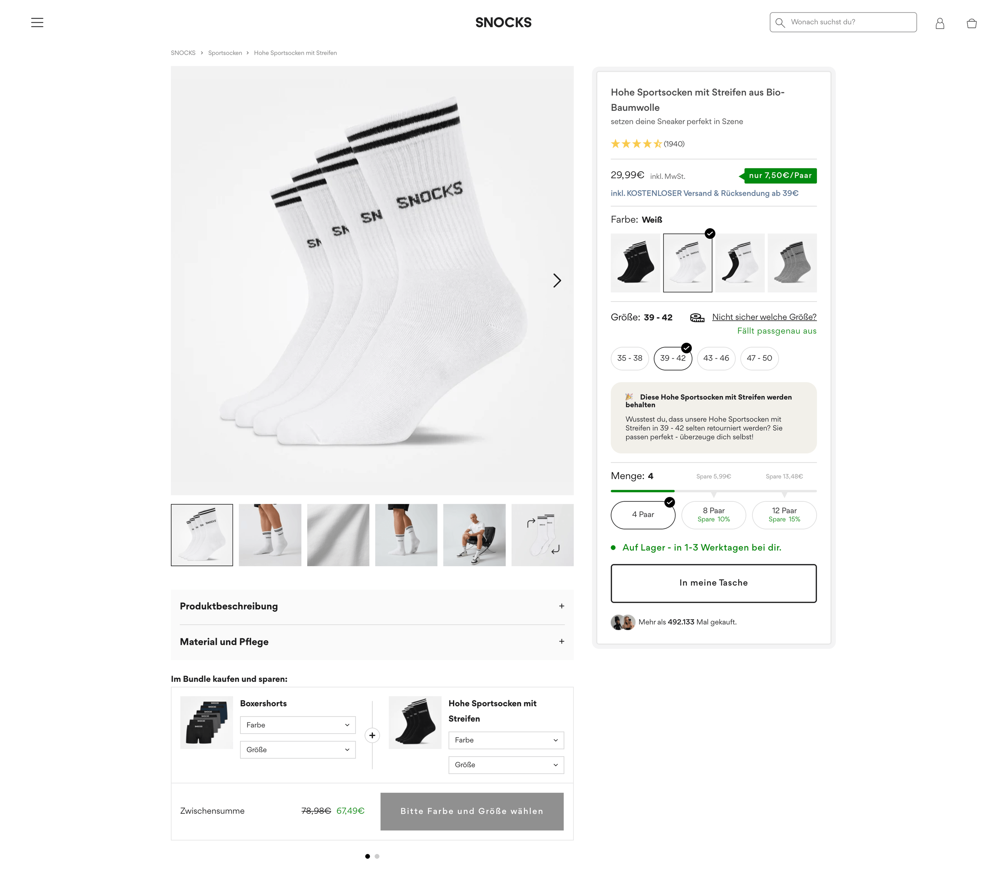
The principle: Pre-selected middle bundle option plus zero friction on color and size selection. No upsell pressure — just fewer obstacles on the way to checkout.
3Bears: How a $7 Product Builds Premium Trust
3Bears proves that conversion optimization isn’t reserved for high-ticket items. Their Overnight Oats at under seven euros uses the same psychological levers as premium shops, convincing customers who might otherwise just grab something off a supermarket shelf.
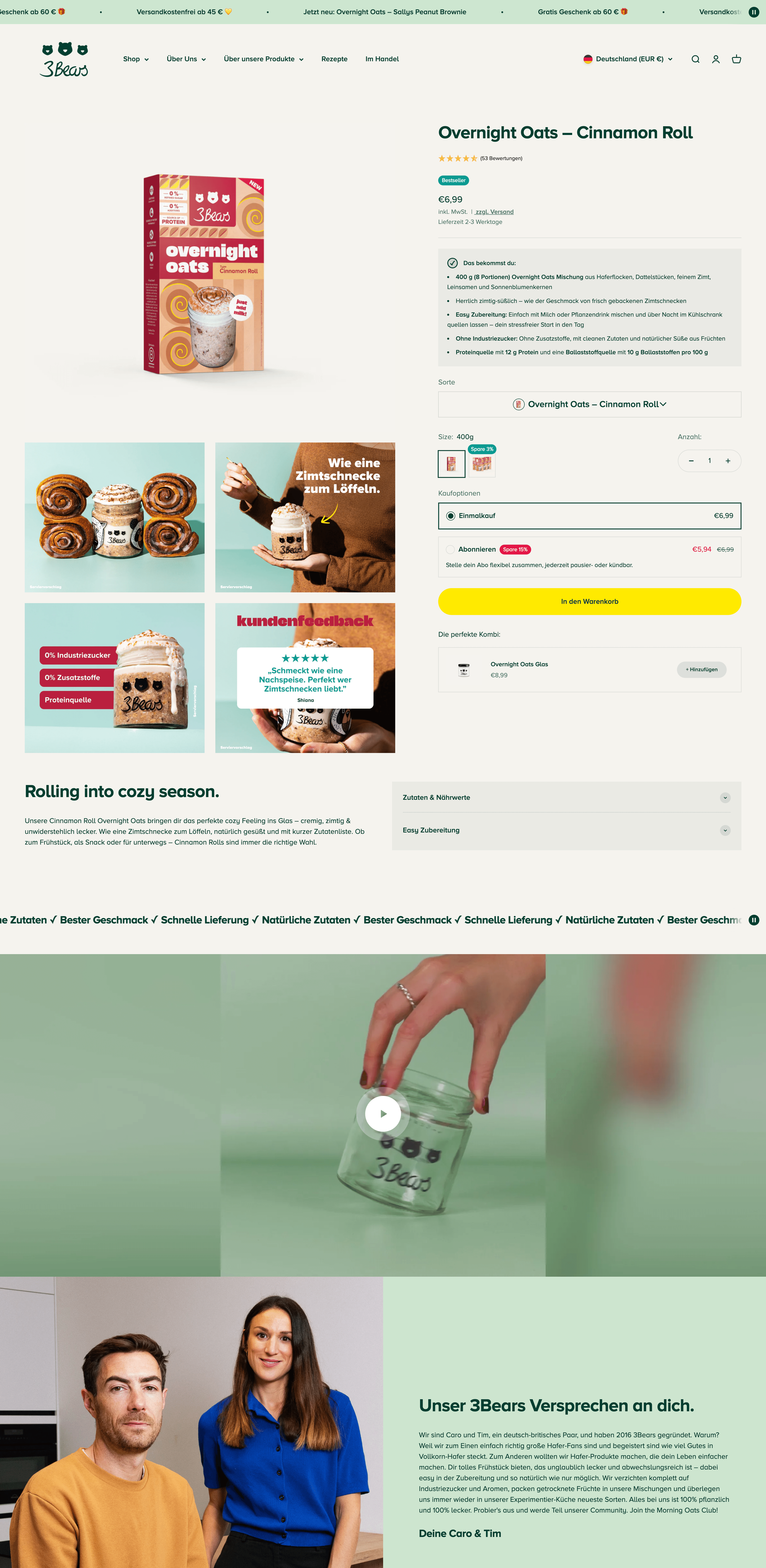
The principle: Trust works at $7 the same as at $70. The price point is no excuse.
The Four Principles Behind These Pages
Doonails, Snocks, and 3Bears look different, but they follow the same logic:
Conversion = Perceived Value > Perceived Risk
When a visitor doesn’t buy, perceived value is too low, perceived risk is too high, or usually both. Four principles close that gap, and all three brands activate all four.
Principle 1: The 3-Second Verdict
Visitors decide in 3 seconds whether to stay or bounce — based on what they see without scrolling.
What all three brands have in common: everything that matters sits in the visible area without a single scroll. Doonails’ configurator, Snocks’ price and swatches, 3Bears’ running USP strip — the execution looks different, but the logic doesn’t. All three answer the same three questions immediately:
- What is this? — Product name plus a headline that communicates the core benefit
- Who is this for? — Value proposition or audience signal
- Why trust this? — At least one trust signal (reviews, badge, delivery time)
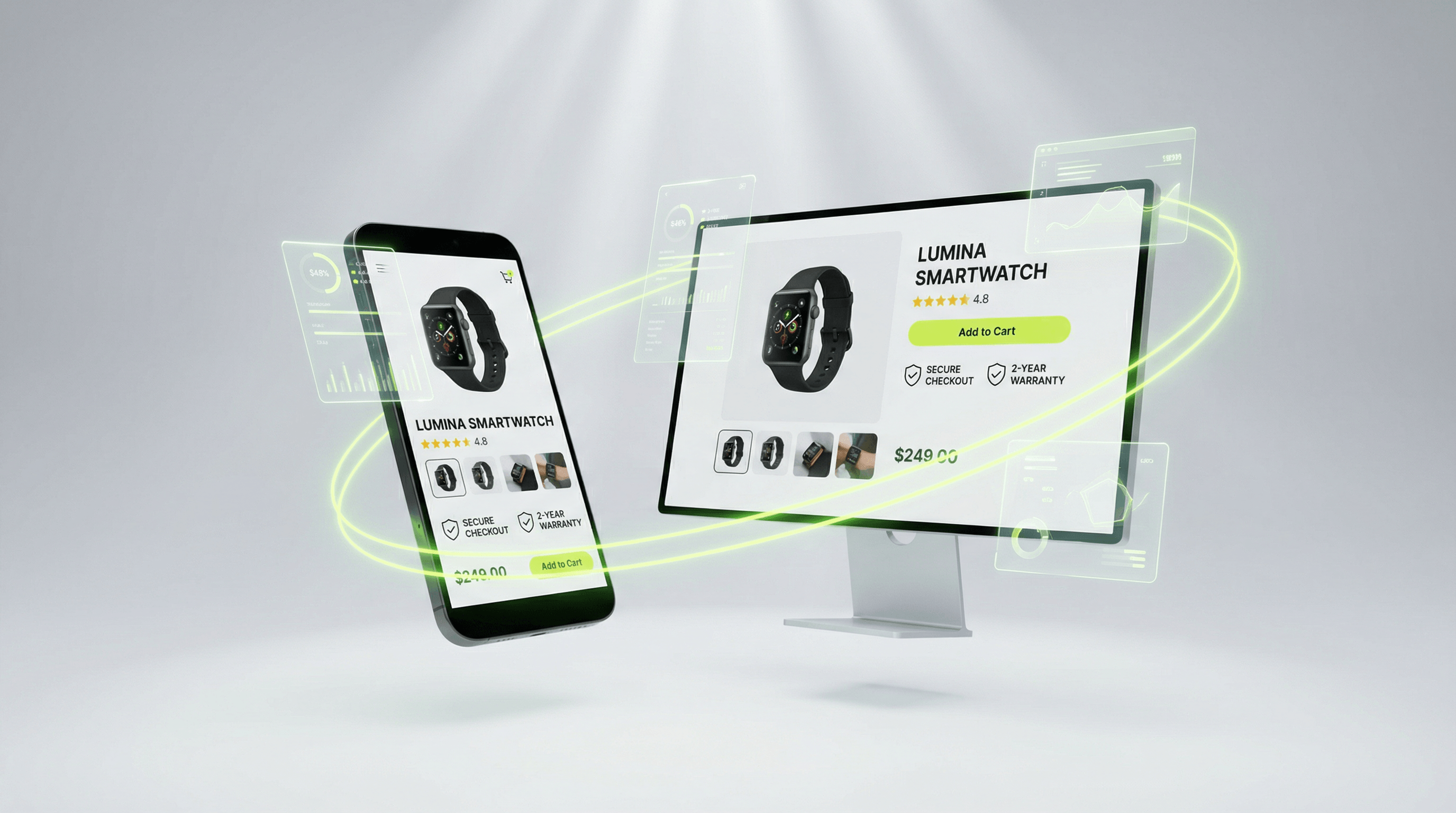
The 7 Essential Elements Above the Fold
| Element | Why it needs to be visible immediately |
|---|---|
| Product name + subheadline | Instant identification and benefit orientation |
| Hero image (min. 800×800 px) | Visual first impression, substitutes haptic perception |
| Price (clear, without distraction) | Trust signal — a hidden price means distrust |
| Star rating + review count | Instant credibility |
| Add-to-cart button (high contrast) | The only CTA that counts |
| Delivery time | Biggest purchase barrier in most markets |
| 1–2 trust badges | Return policy, security, certification |
Mobile checklist (60–75% of your traffic):
- Product name visible in ≤ 2 lines
- Price + star rating in the upper third
- Add-to-cart button reachable without scrolling
- Image carousel with swipe gesture
- Delivery time directly below the price
Principle 2: Build Trust Before the Objection Forms
95% of all purchase decisions are made subconsciously (Harvard Professor Gerald Zaltman). The rational mind doesn’t buy — the subconscious does, and the rational mind justifies it after the fact. Product pages that only deliver facts lose against this principle every time.
Four mechanisms work reliably here:
Social proof is the strongest. Doonails shows 50,000 reviews plus customer photos, and Snocks leads with 70,802 reviews as the first visual element after the product image. Not 4.8 stars — the number. Volume signals market leadership.
Authority creates credibility through external validation: dermatologically tested, certifications, media mentions — directly next to the CTA, not buried in the footer. 3Bears uses the founder photo as personal authority because customers buy from people, not brands.
Scarcity is powerful, but only when it’s authentic. “Only 3 left in stock” at a genuine low inventory level works. Fake countdown timers that reset on page reload destroy trust permanently.
Consistency explains why configurators convert: anyone who’s chosen a color, size, or tier has already made a mental decision. Snocks’ bundle selector and Doonails’ tier configurator use exactly this — the purchase is just confirmation of a choice already made.
The 6 Purchase Objections — and How to Neutralize Each One
A visitor who doesn’t buy has an objection, usually several. Snocks handles two at once with a single element: the info box “These socks will be kept” addresses both return anxiety and quality doubts simultaneously.
| Objection | What the customer thinks | The element that resolves it |
|---|---|---|
| ”Will this fit me?” | Unsure about size, fit, color | Size guide + UGC photos on real bodies |
| ”Can I return it?” | Return anxiety, hidden costs | Return policy directly next to CTA — no link, full text |
| ”When does it arrive?” | Delivery anxiety | Dynamic delivery date (not “3–5 business days”) |
| “Is it worth the price?” | Value unclear | Comparison table / clear benefits breakdown |
| ”Do I trust this store?” | Unknown brand | Trust badges + certifications + genuine reviews |
| ”What if something better exists?” | Fear of a Better Option | Scarcity signal + clear unique selling point |
Principle 3: Make the Product Feel Real
67% of e-commerce cart abandoners say they weren’t sure about the product — they couldn’t touch it, try it on, or experience it. The Baymard Institute confirms: missing product visualization is the most common UX weakness on product detail pages.
Every sense the visitor can’t use online needs to be compensated through content:
| Missing sense | Content compensation |
|---|---|
| Seeing (detail) | Zoom function, 360° view, material close-up |
| Touching | Video: fabric draping, weight in hand, texture close-up |
| Gauging size | Reference object (coin, hand, height comparison) |
| Fit assessment | UGC photos from real customers with their size noted |
| Smell/taste | Sensory language: “nutty, slightly smoky, long-lasting” |
Product Descriptions That Sell — Not Just Describe
The most common mistake: product descriptions describe the product. They should describe the customer — in the moment when the product solves their problem.
The Features-to-Benefits Formula:
| Level | Weak | Strong |
|---|---|---|
| Feature | Waterproof material (IPX6) | — |
| Benefit | Your laptop stays dry | — |
| Emotion | — | “No more panic in the rain. Laptop, books, everything dry — whatever the weather throws at you.” |
Structure of a high-converting product description:
- Headline (1 sentence): Core value proposition
- Lead paragraph (2–3 sentences): For whom, when, and why buy now
- Bullet list (3–5 points): Features with direct benefits, not just specs
- Trust paragraph (1–2 sentences): Origin, quality, story
- FAQ snippets: Answers to the most common questions
Sensory language for physical products:
- Apparel: “Springy, slightly flowing fabric — not stiff, not limp”
- Supplements: “Lightly sweet, no powder aftertaste, dissolves completely”
Image Requirements
Minimum:
- 5–7 images per product (Baymard recommendation)
- Hero image: white background, min. 800×800 px
- Lifestyle image: product in use
- Detail image: material, seam, surface texture
- Size reference: object or person for comparison
For higher conversion:
- Product video (15–45 seconds): construction, material, application
- UGC gallery below the main image
Principle 4: Get Found — on Google and in AI
A well-optimized product page that nobody finds doesn’t sell. The technical setup for Google rankings is the same setup that gets AI systems like ChatGPT, Perplexity, and Claude to cite your page — both benefit from the same structured data.
AI traffic from these systems grew by over 500% in 2025 and 2026. When someone types “best overnight oats to buy” into Perplexity, product pages with structured data get cited preferentially — or they don’t.
Schema.org: One Investment, Two Effects
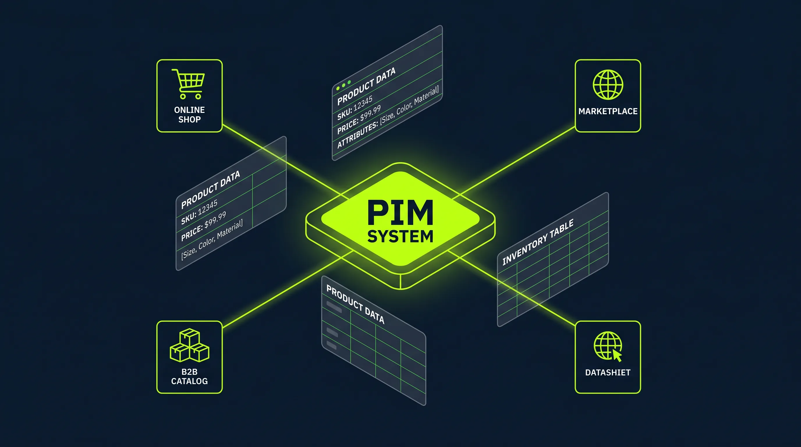
Structured data (Schema.org) tells Google and AI systems simultaneously what’s on your page. For Google, this produces rich snippets (star ratings in search results, +15–30% CTR). For AI systems, it increases the likelihood of being cited because machine-readable product information can be extracted directly.
Most Shopify themes generate Schema markup — but frequently with errors:
@type: Productwithout anoffersobject- Missing
aggregateRating(reviews not showing in search results) - GTIN/MPN missing (important for Google Shopping)
- Static availability (
InStockhardcoded even when sold out)
Correct JSON-LD for Shopify:
{
  "@context": "https://schema.org/",
  "@type": "Product",
  "name": "{{ product.title | escape }}",
  "description": "{{ product.description | strip_html | escape }}",
  "image": "{{ product.featured_image | img_url: 'master' }}",
  "sku": "{{ product.selected_or_first_available_variant.sku }}",
  "brand": { "@type": "Brand", "name": "{{ product.vendor | escape }}" },
  "offers": {
    "@type": "Offer",
    "price": "{{ product.selected_or_first_available_variant.price | divided_by: 100.0 }}",
    "priceCurrency": "EUR",
    "availability": "{% if product.available %}https://schema.org/InStock{% else %}https://schema.org/OutOfStock{% endif %}",
    "url": "{{ shop.url }}{{ product.url }}"
  },
  "aggregateRating": {
    "@type": "AggregateRating",
    "ratingValue": "{{ product.metafields.reviews.rating.value }}",
    "reviewCount": "{{ product.metafields.reviews.rating_count.value }}"
  }
}FAQ Section: For Featured Snippets and AI Citations at Once
A short FAQ section directly on the product page (3–5 questions) serves two functions:
- SEO: Appears in featured snippets and People Also Ask boxes
- GEO: Recognized by AI systems as a structured answer source — the question-answer format matches exactly what Perplexity and ChatGPT extract
AI systems also prefer: clear heading hierarchy (H1 to H2 to H3), definitions directly after headings (“What is X? X is…”), and numbers with source citations.
Question template for product pages:
- Who is this product right for?
- How does it differ from [alternative]?
- How long does [product / effect / warranty] last?
- What happens if I don’t like it?
- Can I combine it with [compatible product]?
Technical Basics
GTIN/MPN in metafields: Google Shopping and AI systems favor complete product identifiers.
- Shopify Admin → Settings → Custom Data → Products
- Add
google.gtin+google.mpn(type: Single line text) - Reference in JSON-LD:
"gtin13": "{{ product.metafields.google.gtin }}"
Canonical tags with variants: Shopify sets canonical tags to the base product URL by default — check the page source of a variant URL (?variant=123456) to confirm <link rel="canonical"> points to the base URL.
App Recommendations by Revenue Stage
| Revenue / Year | Recommendation | Price | Why |
|---|---|---|---|
| $0–50K | Vitals (All-in-One) | from $29.99/mo | Reviews, timers, trust badges, upsell — no app sprawl |
| $50K–300K | Judge.me | from $0/mo | SEO rich snippets, AI review summary, free plan is enough |
| $300K–1M | Loox + Sticky ATC | from $9.99/mo | Visual reviews for fashion/beauty, sticky add-to-cart for mobile |
| $1M+ | Okendo + Rebuy | from $99/mo | Enterprise data, A/B testing, personalization |
Measure and Improve: Prioritizing A/B Tests
The ICE framework (Impact, Confidence, Ease) helps with prioritization — but most stores test the wrong things first.
| Priority | What to test | Why first | Expected uplift |
|---|---|---|---|
| 1. | Add-to-cart: position, color, copy | Highest traffic touchpoint | +5–15% |
| 2. | Hero image: studio vs. lifestyle vs. video | Determines first impression | +8–20% |
| 3. | Price + BNPL options | Purchase barrier #1 for higher prices | +3–10% |
| 4. | Product description headline | Determines whether people scroll | +5–12% |
| 5. | Trust badge combination | What resonates with your specific audience? | +2–8% |
Minimum for meaningful results: 500 unique sessions per variant.
Checklist: 25 Points for Your Product Page
What 1% More Conversion Rate Is Actually Worth
Before you start — run the numbers on what optimization actually means in dollars:
Additional Annual Revenue = Sessions/month × (Target CVR% − Current CVR%) / 100 × AOV × 12| Segment | Conversion Rate | What it means |
|---|---|---|
| Shopify average | 1.4–1.8% | Starting point for most stores |
| Good performance | 2.5–3.2% | Above average, solid foundation |
| Top 20% Shopify | 3.2–5.0%+ | Systematically optimized PDPs |
| Mobile average | 1.8% | Often lower than desktop (3.9%) |
| Add-to-cart average | 4.6–7.5% | Most important micro-conversion indicator |
FAQ: Product Page Optimization
What is a good conversion rate for a Shopify product page?
The Shopify average sits at 1.4–1.8%. Good performance reaches 2.5–3.2%, and the top 20% of Shopify stores land at 3.2–5%+. Mobile CVR is typically lower (avg. 1.8%) than desktop (avg. 3.9%). More important than the absolute number is the trend: if your CVR stagnates while traffic grows, that’s a clear signal your product page needs work.
What elements does a product page absolutely need?
The seven essential elements above the fold: product name with subheadline, hero image (min. 800×800 px), clear price, star rating with review count, prominent add-to-cart button, delivery time, and at least one trust badge. Below that: product description with benefits, UGC photos, return policy directly next to the CTA, and a FAQ section for SEO and GEO.
Why do customers leave the product page without buying?
The six most common purchase barriers: uncertainty about size or fit, return anxiety, unclear delivery time, value doubts, missing trust, and FOPO — Fear of a Better Option. Each one can be neutralized by a specific page element. The objection stack above shows which one handles which.
How important is page speed on the product page?
Very — every additional second of load time costs an average of 0.3% conversion rate. A page that loads in 4 instead of 2 seconds loses roughly 0.6% CVR. At 10,000 monthly sessions and a $75 AOV, that’s around $54,000 in lost annual revenue. The most common causes: unoptimized images, too many JavaScript-heavy apps, and missing browser caching.
How do I set up structured data on my Shopify product page?
Open sections/main-product.liquid in the theme editor and check the JSON-LD object for: complete offers property, aggregateRating from metafields, dynamic availability, and GTIN/MPN when available. Test with the Google Rich Results Test Tool. Correct Schema.org markup helps simultaneously with Google rich snippets and citations from AI systems like Perplexity and ChatGPT.
Which Shopify app is best for product reviews?
It depends on revenue stage. Under $50K: Judge.me (free, SEO-friendly). $50K–500K: Loox (visual, great for fashion and lifestyle with UGC photos). Over $500K: Okendo (enterprise, A/B testing, deep analytics). The critical factor: the app must output review data into the page’s structured data — otherwise no stars appear in search results.
The four principles don’t change. What changes is what your audience perceives as valuable and what triggers their risk perception — and that requires continuous testing, not a one-time fix.
The gap between 1.8% and 3.5% CVR is almost never one big lever. It’s many small gaps that together leave money on the table. Doonails, Snocks, and 3Bears close them systematically, one at a time.
If you want to know where your biggest ones are: Book a call.